Sign up TODAY for Card Making News! Learn More >
FTC Disclosure - If you make a purchase via a link on this site, Card Making Circle may receive a small commission on the transaction.
Amazon Disclosure - As an Amazon Associate Card Making Circle earns from qualifying purchases.
All at no added cost to you. Thank you!
- Home ›
- Card Making Brands ›
- Clarity Stamps
Clarity Stamps
Clarity Stamps is a UK stamp company run by the brilliant Barbara Gray. She invented the clear stamps that are commonly used today.
Barbara also has her own blog "One Day at a Time" where she writes every day about her crafty and personal insights.
During this Covid 19 pandemic she has held (and continues to hold) over 100 days of one hour Facebook Lives (streamed later on You Tube). An inspiration to many that has given sanity during this difficult time.
The stamps are made of a polypolymer resin and are produced in their own factory in Kent. They are high quality and thicker than most clear stamps. They produce an excellent stamped image.
Clarity also sells stencils, dies, Grovvi (parchment craft) and other arty supplies.
In true Clarity style the dies are also high quality and cut beautifully.
The company carries a range of styles as Barbara fosters other artists. This eclectic mix of styles is it's strength as it caters for a wide range of crafters.
There are four monthly Design Club subscriptions from as little as £6. All offer a discount on shop products.
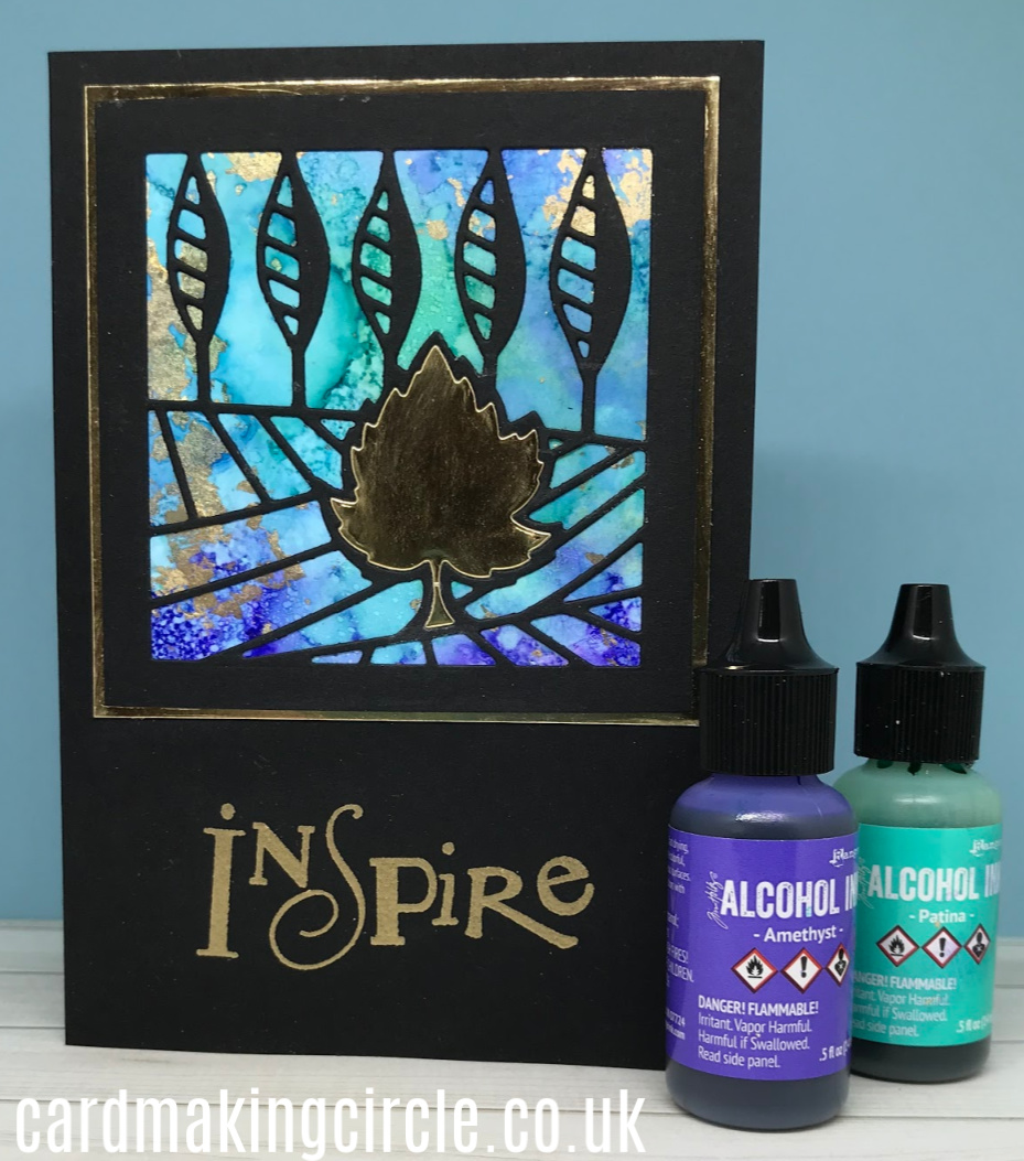
Inspire
The background for this card was one of my early attempts at using alcohol inks.
I used just two colours - Amethyst and Patina Ranger alcohol inks on Yupo paper. As I didn't have any gold I rubbed on gold gilding flakes while the ink was still tacky.
The 3" die cut was from my monthly subscription to the Clarity Die Design club. Like many of Clarity's dies it cut cleanly leaving a window.
The background was mounted onto the dry alcohol ink background and an additional leaf inlaid with gold card.
The die cut square was further mounted onto a gold layer and onto a card base.
The card was completed with an "Inspire" sentiment stamped in gold pigment ink.
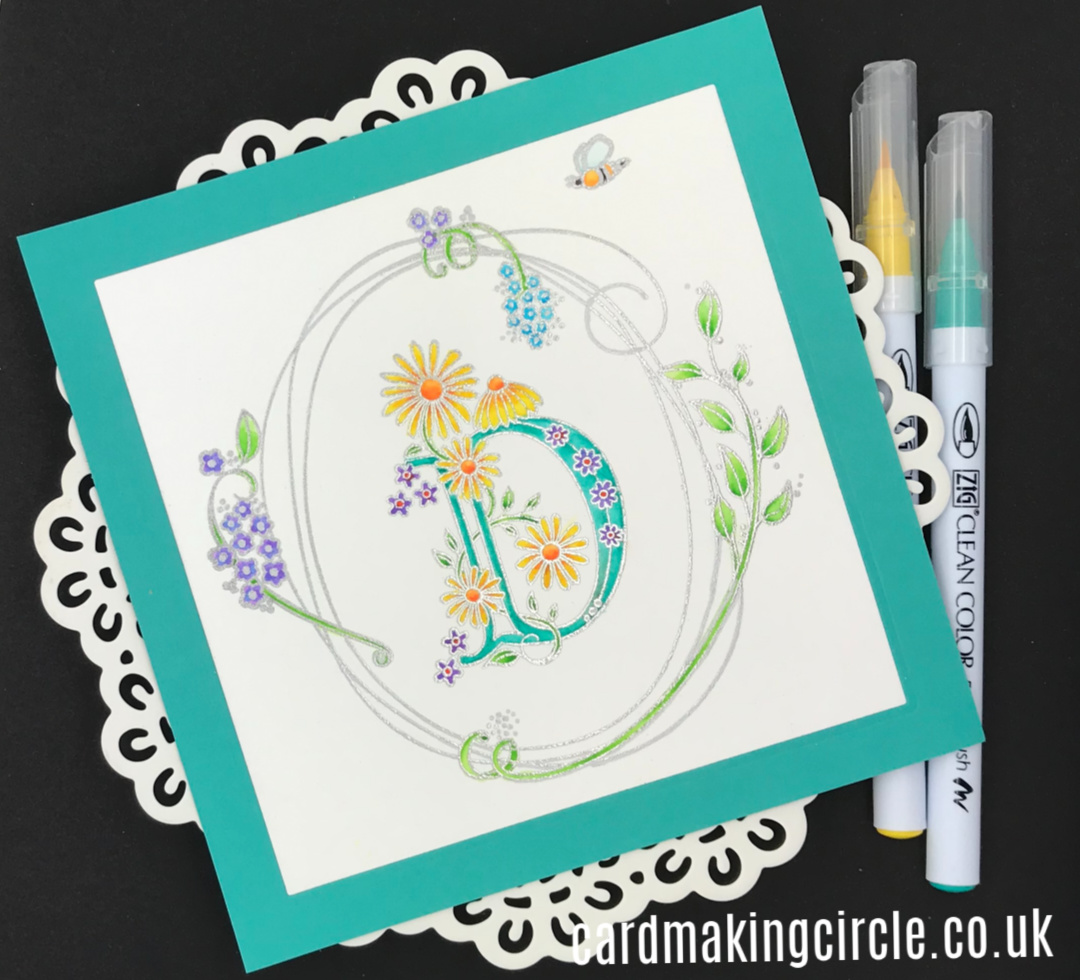
"D"
I'm a great fan of the Clarity Alphabet stamps as they make lovely personal gifts.
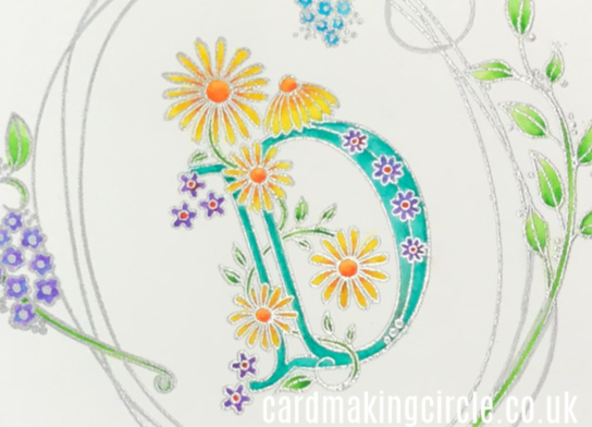
Here the "D" for daisy was combined with the Entwined Summer Oval wreath stamp.
The images were stamped with Versamark ink and heat embossed with silver embossing powder.
They were coloured with Zig Clean Color markers and blended with a water and a paint brush.
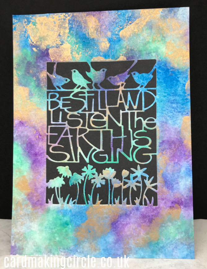
Be Still and Listen
This was an experiment as I wasn't sure whether it would work when I started!
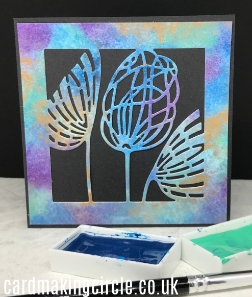
I used watercolour paper and Kuretake Gansai Tambi paints to create a mix of blended colours.
These paints are quite opaque if mixed with only a tiny bit of water and act more like a gouache than watercolour. This helped the gold paint sit on top of the other colours.
When dry I used the "Be still and listen" die and another 3" die from the Die Club to cut the images.
Both were mounted onto black card. The seed heads were made into a card to accompany the "Be still and listen" framed as a gift.
Farm Picture
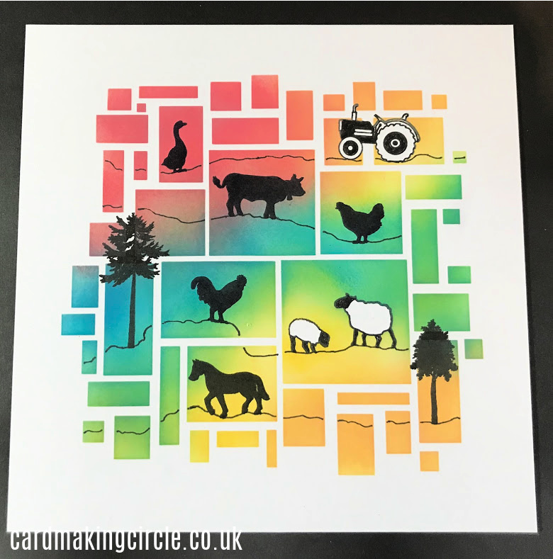
This picture was inspired by one of Barbara's designs on her blog. As soon as I saw it I knew I had to make it for some farming friends in New Zealand.
The background was created using the Clarity art stencil "Abstract Squares 2 " and ink blended with distress inks.
When the background was dry I stamped images from the Wee Farm Animals, Wee Farm Scene and Wee Trees stamp chains with Versafine onyx black ink.
- Home ›
- Card Making Brands ›
- Clarity Stamps
